Designed by People Who Build It
Our designers work alongside the engineers implementing the work, so what gets designed is what actually ships — no beautiful concept that quietly degrades in development.
We help San Antonio businesses automate workflows and turn their websites into revenue-generating systems.
User experience design and brand identity for businesses that want to be taken seriously — and want the design to convert, not just impress.
Most design work fails quietly. The site looks current, the logo is fine, and enquiries still don't come — because nobody asked what the visitor was trying to do, or why they hesitated at the point of contact. Design that performs starts with those questions, not with a colour palette.
Codensic works as a strategic UI/UX and branding partner for companies that need both halves to hold together: a brand identity people remember, and interfaces that get them from curious to converted without friction. We design websites, landing pages, dashboards, and complete visual systems — and because the same team handles custom web development and WordPress builds, what we design is what actually gets shipped.
From a single high-stakes landing page to a complete brand and product design system — handled end to end by one team.
Interfaces with deliberate hierarchy, spacing, and state design — so the next action is always obvious and nothing on screen competes for attention it hasn't earned.
GET STARTEDGET STARTED
We map what users are actually trying to accomplish, then remove the steps, dead ends, and moments of hesitation standing between them and finishing.
GET STARTEDGET STARTEDFull site design from navigation and page structure through to the final screen — built to be implemented, not just to look good in a presentation.
GET STARTEDGET STARTEDSingle-purpose pages designed around one conversion. Message hierarchy, proof placement, and a call to action that carries its weight on mobile as well as desktop.
GET STARTEDGET STARTEDData-dense screens organized so the important number is found in seconds — filters, tables, and charts designed for people using them all day, not for a demo.
GET STARTEDGET STARTEDDesigned at every breakpoint rather than scaled down from desktop, with touch targets, thumb reach, and content order considered on small screens first.
GET STARTEDGET STARTEDMarks built to survive real use — legible at favicon size, readable on a van door, and workable in one colour when the situation calls for it.
GET STARTEDGET STARTEDThe full visual system around the logo: colour palette, typography, imagery direction, and graphic elements that stay recognisable across every channel.
GET STARTEDGET STARTEDDocumentation your team and any future agency can follow — usage rules, spacing, colour values, and the wrong-way examples that prevent the brand drifting.
GET STARTEDGET STARTEDReusable component libraries with defined tokens and states, so new pages get built in days instead of redesigned from scratch every quarter.
GET STARTEDGET STARTEDClickable prototypes you can put in front of real users and stakeholders before development starts, while changes still cost an afternoon instead of a sprint.
GET STARTEDGET STARTEDA structured review of an existing site or product — where users drop off, what's causing friction, and the specific changes most likely to move conversion.
GET STARTEDGET STARTEDResearch first, visuals second — so the design solves a defined problem instead of a guessed one.
We learn your business, audience, and competitors — and define what this design has to achieve before anyone opens a design tool.
We map the routes people take toward converting, then structure information around those journeys instead of around your org chart.
Layout and flow get resolved in low fidelity first, then turned into clickable prototypes so decisions are tested before visuals are applied.
Colour, typography, and imagery come together into a direction — presented as real screens in context, not abstract mood boards.
Final screens are delivered with components, tokens, and documentation, so developers implement exactly what was designed.
After launch we look at how people actually behave and refine the design against real data rather than assumptions.

Design isn't decoration applied at the end. It's the first thing your market judges you on:
Different audiences, different expectations — the design decisions change with them.
Product interfaces, onboarding flows, and marketing sites that make complex software feel obvious.
Identity and site design that signal expertise for firms whose credibility is the product.
Product, category, and checkout design focused on removing hesitation before purchase.
Calm, accessible interfaces where clarity and trust matter more than visual ambition.
Branding and quote flows that turn a local search into a booked estimate.
Visual identity and mobile-first design for businesses discovered on a phone, mid-decision.
What working with us on design looks like in practice.
Our designers work alongside the engineers implementing the work, so what gets designed is what actually ships — no beautiful concept that quietly degrades in development.
We optimise for enquiries, signups, and completed checkouts. A design that wins compliments but doesn't convert hasn't finished its job.
You get the palette, type scale, components, and usage rules that keep the brand coherent long after the project closes.
Editable design files, exported assets, and full documentation are handed over — yours to take to any team or agency, with no dependency on us.
What clients ask us most before starting a design or branding project.
UX is the structure — what steps exist, in what order, and how someone gets from arriving to finishing a task. UI is the surface those steps are expressed through: layout, type, colour, spacing, and states. Strong UI on weak UX produces an attractive interface people still can't use; good UX with careless UI feels sound but cheap. We work on both together, because in practice they're one decision made at two levels of detail.
Both. Plenty of clients bring us in for design and hand the files to their own developers — that's a normal engagement, and it's why we deliver a documented design system rather than flat screens. When we handle implementation too, it goes through our custom web development or WordPress teams, which usually means fewer compromises between the design and the finished build.
A brand identity with logo, palette, typography, and guidelines typically runs 3–5 weeks. Website UI/UX design usually takes 4–8 weeks depending on page count and how much research the project warrants. Product and dashboard interface work is scoped in phases, with the core flows designed and validated before the full surface area is completed. You'll get a specific schedule in the proposal.
Logo files in every format you'll realistically need (vector, raster, light, dark, and single-colour), your colour palette with exact values, a defined type scale, imagery direction, and a written style guide covering correct and incorrect usage. Where relevant we also supply templates for the things you'll produce constantly — social profiles, documents, email signatures.
Yes, and a lot of our work is exactly that. We start with an audit of what's there and what's underperforming. Sometimes the right recommendation is a full rebuild; often it's a focused set of changes to hierarchy, navigation, and key pages that costs far less. An established brand with real recognition is usually worth evolving rather than discarding, and we'll say so when that's the case.
It scales with scope — number of screens, how much research and testing is involved, and whether you need a full identity system or a focused piece of it. A landing page redesign and a complete brand plus product interface sit in very different ranges. After a discovery call you'll get an itemised proposal broken down by phase, so you can see what drives the cost and adjust before committing.
Completely. Editable source files, exported assets, and documentation transfer to you at the end of the project. If you later move to another design team, everything they need goes with you — we don't retain files as a way of keeping clients.
Nobody can promise a conversion rate up front, and we won't pretend otherwise. What we do is reduce the guesswork: research before designing, prototypes tested with real users while changes are still cheap, and established interaction patterns rather than novelty for its own sake. After launch we look at real behaviour — where people drop off, what gets ignored — and refine against that evidence.
Tell us what you’re trying to improve. We’ll review your requirements and recommend the right place to start.
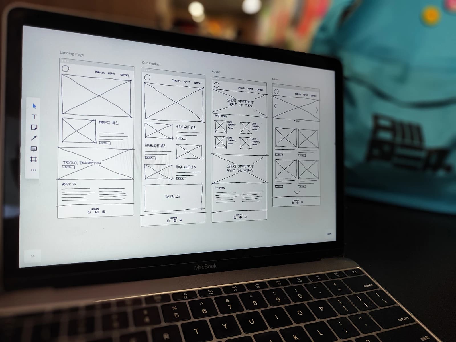
Send us your site or current brand and we'll walk you through what's working, what's costing you conversions, and what we'd change first — no obligation to take it any further.